Wednesday, February 17, 2021

Solr temporal graph queries for event correlation, root cause analysis and temporal anomaly detection

Temporal graph queries will be available in the 8.9 release of Apache Solr. Temporal graph queries are designed for key log analytics use cases such as event correlation and root cause analysis. This blog provides a first look at this important new feature.

Graph Expressions

Graph expressions were first introduced in Solr 6.1 as a general purpose breadth first graph walk with aggregations. In this blog we'll review the graph theory behind Solr's graph expressions and learn how the new temporal graph queries can be applied to event correlation and root cause analysis use cases.

Graphs

Log records and other data indexed in Solr have connections between them that can be seen as a distributed graph. Solr graph expressions provide a mechanism for identifying root nodes in the graph and walking their connections. The general goal of the graph walk is to materialize a specific subgraph and perform link analysis.

In the next few sections below we'll review the graph theory behind Solr's graph expressions.

Subgraphs

A subgraph is a smaller subset of the nodes and connections of the larger graph. Graph expressions allow you to flexibly define and materialize a subgraph from the larger graph stored in the distributed index. 

Subgraphs play two important roles:

1) They provide a specific context for link analysis. The design of the subgraph defines the meaning of the link analysis.

2) They provide a foreground graph that can be compared to the background index for anomaly detection purposes.

Bipartite Subgraphs

Graph expressions can be used to materialize bipartite subgraphs. A bipartite graph is a graph where the nodes are split into two distinct categories. The links between those two categories can then be analyzed to study how they relate. Bipartite graphs are often discussed in the context of collaborative filter recommender systems. 

A bipartite graph between shopping baskets and products is a useful example. Through link analysis between the shopping baskets and products we can determine which products are most often purchased within the same shopping baskets.

In the example below there is a Solr collection called baskets with three fields:

id: Unique ID

basket_s: Shopping basket ID

product_s: Product

Each record in the collection represents a product in a shopping basket. All products in the same basket share the same basket ID.

Let's consider a simple example where we want to find a product that is often sold with butter. In order to do this we could create a bipartite subgraph of shopping baskets that contain butter. We won't include butter itself in the graph as it doesn't help with finding a complementary product for butter. 

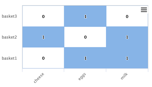
Below is an example of this bipartite subgraph represented as a matrix:


In this example there are three shopping baskets shown by the rows: basket1, basket2, basket3.

There are also three products shown by the columns: cheese, eggs, milk.

Each cell has a 1 or 0 signifying if the product is in the basket.

Let's look at how Solr graph expressions materializes this bipartite subgraph:

The nodes function is used to materialize a subgraph from the larger graph. Below is an example nodes function which materializes the bipartite graph shown in the matrix above.

nodes(baskets,
      random(baskets, q="product_s:butter", fl="basket_s", rows="3"),
      walk="basket_s->basket_s",
      fq="-product_s:butter",
      gather="product_s",
      trackTraversal="true")    

Let's break down this example starting with the random function:

random(baskets, q="product_s:butter", fl="basket_s", rows="3")

The random function is searching the baskets collection with the query product_s:butter, and returning 3 random samples. Each sample contains the basket_s field which is the basket id. The three basket id's that are returned by the random sample are the root nodes of the graph query.

The nodes function is the graph query. The nodes function is operating over the three root nodes returned by the random function. It "walks" the graph by searching the basket_s field of the root nodes against the basket_s field in the index. This finds all the product records for the root baskets. It will then "gather" the product_s field from the records it finds in the walk. A filter is applied so that records with butter in the product_s field will not be returned.

The trackTraversal flag tells the nodes expression to track the links between the root baskets and products.

Node Sets

The output of the nodes function is a node set that represents the subgraph specified by the nodes function. The node set contains a unique set of nodes that are gathered during the graph walk. The "node" property in the result is the value of the gathered node. In the shopping basket example the product_s field is in the "node" property because that was what was specified to be gathered in the nodes expression.

The output of the shopping basket graph expression is as follows:

{ "result-set": { "docs": [ { "node": "eggs", "collection": "baskets", "field": "product_s", "ancestors": [ "basket1", "basket3" ], "level": 1 }, { "node": "cheese", "collection": "baskets", "field": "product_s", "ancestors": [ "basket2" ], "level": 1 }, { "node": "milk", "collection": "baskets", "field": "product_s", "ancestors": [ "basket1", "basket2" ], "level": 1 }, { "EOF": true, "RESPONSE_TIME": 12 } ] } }

The ancestors property in the result contains a unique, alphabetically sorted list of all the incoming links to the node in the subgraph. In this case it shows the basket IDs that are linked to each product. The ancestor links will only be tracked when the trackTraversal flag is turned on in the nodes expression.

Link Analysis and Degree Centrality

Link analysis is often performed to determine node centrality. When analyzing for centrality the goal is to assign a weight to each node based on how connected it is in the subgraph. There are different types of node centrality. Graph expressions very efficiently calculates inbound degree centrality (indegree)

Inbound degree centrality is calculated by counting the number of inbound links to each node. For brevity this article will refer to inbound degree simply as degree.

Back to the shopping basket example:


We can calculate the degree of the products in the graph by summing the columns:
cheese: 1
eggs: 2
milk: 2

From the degree calculation we know that eggs and milk appear more frequently in shopping baskets with butter than cheese does.

The nodes function can calculate degree centrality by adding the count(*) aggregation as shown below:

nodes(baskets,
      random(baskets, q="product_s:butter", fl="basket_s", rows="3"),
      walk="basket_s->basket_s",
      fq="-product_s:butter",
      gather="product_s",
      trackTraversal="true",
      count(*))    

The output of this graph expression is as follows:

{ "result-set": { "docs": [ { "node": "eggs", "count(*)": 2, "collection": "baskets", "field": "product_s", "ancestors": [ "basket1", "basket3" ], "level": 1 }, { "node": "cheese", "count(*)": 1, "collection": "baskets", "field": "product_s", "ancestors": [ "basket2" ], "level": 1 }, { "node": "milk", "count(*)": 2, "collection": "baskets", "field": "product_s", "ancestors": [ "basket1", "basket2" ], "level": 1 }, { "EOF": true, "RESPONSE_TIME": 17 } ] } }

The count(*) aggregation counts the "gathered" nodes, in this case the values in the product_s field. Notice that the count(*) result is the same as the number of ancestors. This will always be the case because the nodes function first deduplicates the edges before counting the gathered nodes. Because of this the count(*) aggregation always calculates the degree centrality for the gathered nodes.

Dot Product

There is a direct relationship between the inbound degree with bipartite graph recommenders and the dot product. This relationship can be clearly seen in our working example once you include a column for butter:


If we compute the dot product between the butter column and the other product columns you will find that the dot product equals the inbound degree in each case. This tells us that a nearest neighbor search, using a maximum inner product similarity, would select the column with the highest inbound degree. 

Node Scoring

The degree of the node describes how many nodes in the subgraph link to it. But this does not tell us if the node is particularly central to this subgraph or if it is just a very frequent node in the entire graph. Nodes that appear frequently in the subgraph but infrequently in the entire graph can be considered more relevant to the subgraph. 

The search index contains information about how frequently each node appears in the entire index. Using a technique similar to tf-idf document scoring, graph expressions can combine the degree of the node with its inverse document frequency in the index to determine a relevancy score. 

The scoreNodes function scores the nodes. Below is an example of the scoreNodes function applied to the shopping basket node set.

scoreNodes(nodes(baskets,
                 random(baskets, q="product_s:butter", fl="basket_s", rows="3"),
                 walk="basket_s->basket_s",
                 fq="-product_s:butter",
                 gather="product_s",
                 trackTraversal="true",
                 count(*)))
The output now includes a nodeScore property. In the output below notice how eggs has a higher nodeScore than milk even though they have the same count(*). This is because milk appears more frequently in the entire index than eggs does. Because of this eggs is considered more relevant to this subgraph, and a better recommendation to be paired with butter.

{ "result-set": { "docs": [ { "node": "eggs", "nodeScore": 3.8930247, "field": "product_s", "numDocs": 10, "level": 1, "count(*)": 2, "collection": "baskets", "ancestors": [ "basket1", "basket3" ], "docFreq": 2 }, { "node": "milk", "nodeScore": 3.0281217, "field": "product_s", "numDocs": 10, "level": 1, "count(*)": 2, "collection": "baskets", "ancestors": [ "basket1", "basket2" ], "docFreq": 4 }, { "node": "cheese", "nodeScore": 2.7047482, "field": "product_s", "numDocs": 10, "level": 1, "count(*)": 1, "collection": "baskets", "ancestors": [ "basket2" ], "docFreq": 1 }, { "EOF": true, "RESPONSE_TIME": 26 } ] } }

Temporal Graph Expressions

The examples above lay the groundwork for Solr's new temporal graph queries. Temporal graph queries allow Solr to walk the graph using windows of time. The initial release supports graph walks using ten second increments which is useful for event correlation and root cause analysis use cases in log analytics. 

In order to support temporal graph queries a ten second truncated timestamp in ISO 8601 format must be added to the log records as a string field at indexing time. Here is a sample ten second truncated timestamp: 2021-02-10T20:51:30Z. This small data change enables some very important use cases so it's well worth the effort.

Solr's indexing tool for Solr logs, described here, already adds the ten second truncated timestamps. So those using Solr to analyze Solr logs get temporal graph expressions for free. 

Root Events

Once the ten second windows have been indexed with the log records we can devise a query that creates a set of root events. We can demonstrate this with an example using Solr log records. 

In this example we'll perform a Streaming Expression facet aggregation that finds the top 25, ten second windows with the highest average query time. These time windows can be used to represent slow query events in a temporal graph query. 

Here is the facet function:

facet(solr_logs, q="+type_s:query +distrib_s:false",  buckets="time_ten_second_s", avg(qtime_i))

Below is a snippet of the results with the 25 windows with the highest average query times:

{ "result-set": { "docs": [ { "avg(qtime_i)": 105961.38461538461, "time_ten_second_s": "2020-08-25T21:05:00Z" }, { "avg(qtime_i)": 93150.16666666667, "time_ten_second_s": "2020-08-25T21:04:50Z" }, { "avg(qtime_i)": 87742, "time_ten_second_s": "2020-08-25T21:04:40Z" }, { "avg(qtime_i)": 72081.71929824562, "time_ten_second_s": "2020-08-25T21:05:20Z" }, { "avg(qtime_i)": 62741.666666666664, "time_ten_second_s": "2020-08-25T12:30:20Z" }, { "avg(qtime_i)": 56526, "time_ten_second_s": "2020-08-25T12:41:20Z" }, ...

{ "avg(qtime_i)": 12893, "time_ten_second_s": "2020-08-25T17:28:10Z" }, { "EOF": true, "RESPONSE_TIME": 34 } ] } }

Temporal Bipartite Subgraphs

Once we've identified a set of root event windows it's easy to perform a graph query that creates a bipartite graph of the log events that occurred within the same ten second windows. With Solr logs there is a field called type_s which is the type of log event. 

In order to see what log events happened in the same ten second window of our root events we can "walk" the ten second windows and gather the type_s field.

nodes(solr_logs,
      facet(solr_logs, 
            q="+type_s:query +distrib_s:false", 
            buckets="time_ten_second_s", 
            avg(qtime_i)),
      walk="time_ten_second_s->time_ten_second_s",
      gather="type_s",
      count(*))

Below is the resulting node set:

{

"result-set": { "docs": [ { "node": "query", "count(*)": 10, "collection": "solr_logs", "field": "type_s", "level": 1 }, { "node": "admin", "count(*)": 2, "collection": "solr_logs", "field": "type_s", "level": 1 }, { "node": "other", "count(*)": 3, "collection": "solr_logs", "field": "type_s", "level": 1 }, { "node": "update", "count(*)": 2, "collection": "solr_logs", "field": "type_s", "level": 1 }, { "node": "error", "count(*)": 1, "collection": "solr_logs", "field": "type_s", "level": 1 }, { "EOF": true, "RESPONSE_TIME": 50 } ] } }

In this result set the node field holds the type of log events that occurred within the same ten second windows as the root events. Notice that the event types include: query, admin, update and error. The count(*) shows the degree centrality of the different log event types.

Notice that there is 1 error event within the same ten second windows of the slow query events. 

Window Parameter

For event correlation and root cause analysis it's not enough to find events that occur within the same ten second root event windows. What's needed is to find events that occur within a window of time prior to each root event window. The window parameter allows you to specify this prior window of time as part of the query. The window parameter is an integer which specifies the number of ten second time windows, prior to each root event window, to include in the graph walk. 

nodes(solr_logs,
      facet(solr_logs, 
            q="+type_s:query +distrib_s:false", 
            buckets="time_ten_second_s", 
            avg(qtime_i)),
      walk="time_ten_second_s->time_ten_second_s",
      gather="type_s",     
      window="3",
      count(*)) 

Below is the node set returned when the window parameter is added. Notice that there are 29 error events within the 3 ten second windows prior to the slow query events. 

{ "result-set": { "docs": [ { "node": "query", "count(*)": 62, "collection": "solr_logs", "field": "type_s", "level": 1 }, { "node": "admin", "count(*)": 41, "collection": "solr_logs", "field": "type_s", "level": 1 }, { "node": "other", "count(*)": 48, "collection": "solr_logs", "field": "type_s", "level": 1 }, { "node": "update", "count(*)": 11, "collection": "solr_logs", "field": "type_s", "level": 1 }, { "node": "error", "count(*)": 29, "collection": "solr_logs", "field": "type_s", "level": 1 }, { "EOF": true, "RESPONSE_TIME": 117 } ] } }

Degree as a Representation of Correlation

By performing link analysis on the temporal bipartite graph we can calculate the degree of each event type that occurs in the specified time windows. We established in the bipartite graph recommender example the direct relationship between inbound degree and the dot product. In the field of digital signal processing the dot product is used to represent correlation. In our temporal graph queries we can then view the inbound degree as a representation of correlation between the root events and the events that occur within the specified time windows.

Lag Parameter

Understanding the lag in the correlation is important for certain use cases. In a lagged correlation an event occurs and following a delay another event occurs. The window parameter doesn't capture the delay as we only know that an event occurred somewhere within a prior window. 

The lag parameter can be used to start calculating the window parameter a number of ten second windows in the past. For example we could walk the graph in 20 seconds windows starting from 30 seconds prior to a set of root events. By adjusting the lag and re-running the query we can determine which lagged window has the highest degree. From this we can determine the delay.

Node Scoring and Temporal Anomaly Detection

The concept of node scoring can be applied to temporal graph queries to find events that are both correlated with a set of root events and anomalous to the root events. The degree calculation establishes the correlation between events but it does not establish if the event is a very common occurrence in the entire graph or specific to the subgraph.

The scoreNodes functions can be applied to score the nodes based on the degree and the commonality of the node's term in the index. This will establish whether the event is anomalous to the root events. 

scoreNodes(nodes(solr_logs,
                 facet(solr_logs, 
                       q="+type_s:query +distrib_s:false", 
                       buckets="time_ten_second_s", 
                       avg(qtime_i)),
                 walk="time_ten_second_s->time_ten_second_s",
                 gather="type_s",     
                 window="3",
                 count(*)))
Below is the node set once the scoreNodes function is applied. Now we see that the highest scoring node is the error event. This score give us a good indication of where to begin our root cause analysis.
{
  "result-set": {
    "docs": [
      {
        "node": "other",
        "nodeScore": 23.441727,
        "field": "type_s",
        "numDocs": 4513625,
        "level": 1,
        "count(*)": 48,
        "collection": "solr_logs",
        "docFreq": 99737
      },
      {
        "node": "query",
        "nodeScore": 16.957537,
        "field": "type_s",
        "numDocs": 4513625,
        "level": 1,
        "count(*)": 62,
        "collection": "solr_logs",
        "docFreq": 449189
      },
      {
        "node": "admin",
        "nodeScore": 22.829023,
        "field": "type_s",
        "numDocs": 4513625,
        "level": 1,
        "count(*)": 41,
        "collection": "solr_logs",
        "docFreq": 96698
      },
      {
        "node": "update",
        "nodeScore": 3.9480786,
        "field": "type_s",
        "numDocs": 4513625,
        "level": 1,
        "count(*)": 11,
        "collection": "solr_logs",
        "docFreq": 3838884
      },
      {
        "node": "error",
        "nodeScore": 26.62394,
        "field": "type_s",
        "numDocs": 4513625,
        "level": 1,
        "count(*)": 29,
        "collection": "solr_logs",
        "docFreq": 27622
      },
      {
        "EOF": true,
        "RESPONSE_TIME": 124
      }
    ]
  }
}

Tuesday, February 9, 2021

Driving down cloud storage costs with Apache Solr's hybrid indexed and raw log analytics engine

Search engines are powerful tools for log analytics. They excel at slicing and dicing data over clusters and running distributed aggregations and statistical analysis. But maintaining a log analytics search index for terabytes or petabytes of log data involves running huge search clusters and incurs large cloud storage expenses to store the indexes. Often what's actually needed is a grep like capability that includes aggregations and visualization rather than the full power of the search index for historical data. 

The next release of Apache Solr provides a hybrid approach to log analytics that supports both log analytics queries over a search cluster and the ability to grep, aggregate and visualize compressed log files. 

Solr's Streaming Expressions and Math Expressions are a powerful query language for analytics and visualization. You can read about Streaming Expressions and Math Expressions in Solr's Visual Guide (https://lucene.apache.org/solr/guide/8_8/math-expressions.html). If you haven't seen this guide it's useful to quickly review the TOC to see the power here and compare to what ElasticSearch offers.

In the next release of Solr a subset of Streaming Expressions and Math Expressions can be applied to raw compressed log files using the cat function. The cat function reads files from a specific place in the filesystem and returns a stream of lines from the files. The cat function can then be wrapped by other functions to parse, filter, aggregate and visualize.

Below is a simple example of the cat function wrapped by the parseCSV function to parse a comma separated file into tuples which can be immediately visualized by Zeppelin using the Zepplin-Solr interpreter.


Reading GZipped Files

In the next release of Solr the cat function will be able read gzipped files in place without expanding on disk. The cat function will automatically read gzipped files based on the .gz file extension. Log files that are gzip compressed often have an 80% reduction in size.

On Demand Indexing

One of the capabilities provided is on-demand indexing of historical data. There will be times when the grep and aggregate functions won't be enough to support the analytics requirement. In this scenario Streaming Expressions supports a rich set of functions for on-demand indexing from raw compressed log data. The example below shows the cat function wrapped by the select function which is renaming fields in the tuples. The update function then indexes the tuples to a Solr Cloud collection.


Once the data is indexed the full power of Streaming Expressions and Math Expressions can be applied to the data.

Aggregations Over Raw Compressed Log Files

The cat function can also be wrapped by the having function to perform regex filtering, the select function to transform tuples and the hashRollup function to perform aggregations directly over compressed log files. 

Let's build a time series aggregation one step at a time:

cat("2021/01")

The cat function reads all the files inside the 2021/01 directory. These are log files from January 2021. These log files are in CSV format and are gzipped individually. 

parseCSV(cat("2021/01"))

The parseCSV function wraps the cat function and parses each CSV formatted log line into a tuple of name value pairs.

select(parseCSV(cat("2021/01")),
       trunc(timestamp, 10) as day,
       long(qtime) as query_time)

The select function transforms each tuple by truncating the timestamp field on the 10th character to return the yyyy-MM-dd part of the timestamp and mapping it to the "day" field. It also casts the qtime field to a long and maps it to the "query_time" field.

hashRollup(
    select(parseCSV(cat("2021/01")),
           trunc(timestamp, 10) as day,
           long(qtime) as query_time),
    over="day",
    avg(query_time))

Finally the hashRollup function performs an aggregation over the truncated time stamp (day field) averaging the query_time.

The output of this expression is a time series which can be immediately visualized and shared in Apache-Zeppelin using the Zeppelin-Solr interpreter.


Thursday, January 21, 2021

Optimizations Coming to Solr


Starting in Solr 8.8 and continuing into Solr 9.0 there are a number of optimizations to be aware of that provide breakthroughs in performance for important use cases.


Optimized Self Join (https://issues.apache.org/jira/browse/SOLR-15049)


This optimization is a breakthrough in performance for document level access control. It is by far the fastest filter join implementation in the Solr project and is likely the fastest access control join available for search engines. 


This optimization requires that the joined documents reside in the same Solr core and that the join key field be the same for both sides of the join. For access control this means the access control records must be in the same core as the main document corpus and the join from access control records to the main documents must use the same field.  


The optimization in this scenario is significant. The performance of the join allows it to scale to much larger joins. For example joins that involve upwards of 500,000 join keys can be executed with sub-second performance. In an access control setting this translates to 500,000+ access control groups which can be used to filter the main document set, with sub-second performance. That represents more than a 10x increase in join size over the next fastest Solr filter join which can perform joins with up to 50,000 access control groups and achieve sub-second performance. 


A followup blog will discuss the technical details of this optimization and how it can be implemented in a sharded Solr Cloud installation. 

Tiered Aggregations (https://issues.apache.org/jira/browse/SOLR-15036)


This optimization is a breakthrough for large scale aggregations. A typical Solr aggregation using JSON facets has one aggregator node. In this scenario aggregations from all the shards are collected in one place and merged. This technique has limits in scalability because eventually the number of threads used to contact the shards and amount of time and memory it takes to perform the merge is prohibitive.


Tiered aggregations eliminates the single aggregator bottleneck by setting up a tier of aggregator nodes. Each aggregator node performs a JSON facet aggregation for a subset of shards. Then a single top level aggregator node merges the aggregations from the tier of aggregator nodes.  The partitioning of the middle tier of aggregator nodes happens automatically when aggregating over a Solr Cloud alias which points to multiple collections. In this scenario an aggregator node is assigned to each collection in the alias. 


Tiered aggregation allows for real-time aggregations over very large clusters. For example: 200 aggregator nodes each calling 200 shards is a realistic scenario, providing real time aggregations across 40,000 shards. 


Improved export sorting performance and efficient high cardinality aggregations (https://issues.apache.org/jira/browse/SOLR-14608)


Both Solr and Elasticsearch have traditionally not been effective high cardinality aggregation engines.


Solr’s export handler has undergone a series of performance improvements culminating with a new technique for sorting that improves the throughput of some export queries by 100%. The improved sorting performance is part of a set of changes designed to support a performant and efficient high cardinality aggregation engine.


High cardinality aggregation often occurs in data warehousing due to multi-dimensional aggregations that result in a high number of dimensional combinations. Traditional search engine approaches to aggregations do not work well in high cardinality use cases.


Traditional faceted aggregation is not well suited for high cardinality aggregation because it tracks the full aggregation in memory at once. When performing high cardinality aggregation it’s often not practical to track all dimensions in memory. Solr's export handler solves this by first sorting the result set on the aggregation dimensions and then rolling up aggregations one group at a time. Using this technique high cardinality aggregations can be accomplished using a small amount of memory.


The export handler also now has the capability of running a Streaming Expression in memory over the sorted result set. This means high cardinality aggregations can be done inside the export handler allowing the export handler to return aggregated results. This can greatly reduce the amount of data that needs to be sent across the network to aggregate over the sorted/exported results. 


Spark-Solr aggregations will also benefit from the improved performance of the export handler because Spark-Solr uses the export handler to return results for aggregations.

Improved collapse performance/efficiency, block collapse (https://issues.apache.org/jira/browse/SOLR-15079)


Solr’s collapse feature is often used for larger e-commerce catalogs with a high number of products that don’t perform well with Lucene/Solr grouping. Solr’s collapse can now take advantage of block indexing/nested documents to significantly improve query performance, cutting search times in half in some scenarios,  while decreasing the memory used by collapse by 99%. In order to take advantage of this feature catalogs will need to be indexed such that all SKU’s that share the same product ID are indexed in the same block.


The improved performance and efficiency will allow for more scalability (higher QPS with less hardware) and provide faster response times for ecommerce search applications. The improved performance also leaves more time to improve relevance with advanced ranking algorithms. 


Monday, March 30, 2020

New York - Coronavirus Statistics (NYTimes Data Set)

As of 2020-04-09

New York City - Cumulative Cases By Day


New York City - Cumulative Deaths By Day


New York City - Cumulative Cases and Deaths


New York City - New Cases By Day


New York City - Growth Rate of Cases


New York City - Mortality Rate


New York State - Cumulative Cases By Day


New York State - New Cases By Day


New York State - Growth Rate of Cases


New York State - Mortality Rate


New York State - Percent of Cases By County


Monday, November 27, 2017

Feature Scaling with Solr Streaming Expressions

Before performing machine learning operations its often important to scale the feature vectors so they can be compared at the same scale. In Solr 7.2 the Streaming Expression statistical function library provides a rich set of feature scaling functions that work on both vectors and matrices.

This blog will describe the different feature scaling functions and provide examples to show how they differ from each other.

Min/Max Scaling

The minMaxScale function scales a vector or matrix between a min and max value. By default it will scale between 0 and 1 if min/max values are not provided. Min/Max scaling is useful when comparing time series of different scales in machine learning algorithms such as k-means clustering.

Below is the sample code for scaling a matrix:

let(a=array(20, 30, 40, 50),
    b=array(200, 300, 400, 500),
    c=matrix(a, b),
    d=minMaxScale(c))

The expression above creates two arrays at different scales. The arrays are then added to a matrix and scaled with the minMaxScale function.

Solr responds with the vectors of the scaled matrix:

{ "result-set": { "docs": [ { "d": [ [ 0, 0.3333333333333333, 0.6666666666666666, 1 ], [ 0, 0.3333333333333333, 0.6666666666666666, 1 ] ] }, { "EOF": true, "RESPONSE_TIME": 0 } ] } }

Notice that once brought into the same scale the vectors are the same.

Standardizing

Standardizing scales a vector so that it has a mean of 0 and a standard deviation of 1. Standardization can be used with machine learning algorithms, such as SVM, that perform better when the data has a normal distribution.  

Standardization does lose information about the data if the underlying vectors don't fit a normal distribution. So use standardization with care.

Here is an example of how to standardize a matrix:

let(a=array(20, 30, 40, 50),
    b=array(200, 300, 400, 500),
    c=matrix(a, b),
    d=standardize(c))

Solr responds with the vectors of the standardized matrix:

{ "result-set": { "docs": [ { "d": [ [ -1.161895003862225, -0.3872983346207417, 0.3872983346207417, 1.161895003862225 ], [ -1.1618950038622249, -0.38729833462074165, 0.38729833462074165, 1.1618950038622249 ] ] }, { "EOF": true, "RESPONSE_TIME": 17 } ] } }

Unitizing

Unitizing scales vectors to a magnitude of 1. A vector with a magnitude of 1 is known as a unit vector.  Unit vectors are preferred when the vector math deals with vector direction rather than magnitude.

let(a=array(20, 30, 40, 50),
    b=array(200, 300, 400, 500),
    c=matrix(a, b),
    d=unitize(c))

Solr responds with the vectors of the unitized matrix:

{ "result-set": { "docs": [ { "d": [ [ 0.2721655269759087, 0.40824829046386296, 0.5443310539518174, 0.6804138174397716 ], [ 0.2721655269759087, 0.4082482904638631, 0.5443310539518174, 0.6804138174397717 ] ] }, { "EOF": true, "RESPONSE_TIME": 6 } ] } }

Normalized Sum

The final feature scaling function is the normalizeSum function which scales a vector so that it sums to a specific value. By default its scales the vector so that it sums to 1. This technique is useful when you want to convert vectors of raw counts to vectors of probabilities. 


Below is the sample code for applying the normalizeSum function:

let(a=array(20, 30, 40, 50),
    b=array(200, 300, 400, 500),
    c=matrix(a, b),
    d=normalizeSum(c))

Solr responds with the vectors scaled to a sum of 1:

{ "result-set": { "docs": [ { "d": [ [ 0.14285714285714285, 0.21428571428571427, 0.2857142857142857, 0.35714285714285715 ], [ 0.14285714285714285, 0.21428571428571427, 0.2857142857142857, 0.35714285714285715 ] ] }, { "EOF": true, "RESPONSE_TIME": 0 } ] } }

Sunday, November 5, 2017

An Introduction to Markov Chains in Solr 7.2

This blog introduces Solr's new Markov Chain implementation coming in Solr 7.2.  We'll first cover how Markov Chains work and then show how they are supported through the Streaming Expression statistical library.

Markov Chain

A Markov Chain uses probabilities to model the state transitions of a process. A simple example taken from the Markov Chain wiki page will help illustrate this.

In this example we'll be modeling the state transitions of the stock market. In our model the stock market can have three possible states:
  • Bull
  • Bear
  • Stagnant
There are two important characteristics of a Markov Process:

1) The process can only be in one state at a time.

2) The probability of transitioning between states is based only on the current state. This is known as "memorylessness". 

Below is a state diagram of the probabilities of transferring between the different states.


In the diagram above, the lines show the probabilities of transitioning between the different states. For example there is .075 probability of transitioning from a Bull market to a Bear market.  There is .025 probability of transitioning from a Bull market to a Stagnant market. There is a .9 probability of a Bull market transitioning to another Bull market.

The state transition probabilities in this example can be captured in a 3x3 matrix called a transition matrix. The transition matrix for this example is:
                    
                   Bull   Bear    Stagnant
Bull         |     .9     .075    .025    |
Bear         |     .15    .8      .05     |
Stagnant     |     .25    .25     .5      |

Notice each state has a row in the matrix. The values in the columns hold the transition probabilities for each state. 

For example row 0, column 0 is the probability of the Bull market transitioning to another Bull market. Row 1, column 0 is the probability of the Bear market transitioning to a Bull market.

A Markov Chain uses the transition matrix to model and simulate the transitions in the process. A code example will make this more clear.

Working with Matrices

In Solr 7.2 support for matrices has been added to the Streaming Expression statistical function library. Below is the expression for creating the example transition matrix:

let(a=array(.9, .075, .025),
    b=array(.15, .8, .05),
    c=array(.25, .25, .5),
    d=matrix(a, b, c))
  
In the expression above the rows of the matrix are created as numeric arrays and set to variables a, b and c. Then the arrays are passed to the matrix function to instantiate the matrix.

If we send this expression to Solr's /stream handler it responds with:

{ "result-set": { "docs": [ { "d": [ [ 0.9, 0.075, 0.025 ], [ 0.15, 0.8, 0.05 ], [ 0.25, 0.25, 0.5 ] ] }, { "EOF": true, "RESPONSE_TIME": 0 } ] } }

Markov Chain Simulations

Once the transition matrix is created its very easy to create a Markov Chain and simulate the process. Here is a sample expression:

let(a=array(.9, .075, .025),
    b=array(.15, .8, .05),
    c=array(.25, .25, .5),
    d=matrix(a, b, c),
    e=markovChain(d),
    f=sample(e, 5))

In the expression above the transition matrix is created and then passed as a parameter to the markovChain function. The markovChain function returns a Markov Chain for the specific transition matrix.

The Markov Chain can then be sampled using the sample function. In the example above 5 samples are taken from the Markov Chain. The samples represent the state that the process is in. This transition matrix has three states so each sample will either be 0 (Bull), 1 (Bear) or 2 (Stagnant).

Each time the Markov Chain is sampled it returns the next state of the process based on the transition probabilities of its current state.

If we send this expression to the /stream handler it may respond with:

{ "result-set": { "docs": [ { "f": [ 0, 0, 0, 2, 2 ] }, { "EOF": true, "RESPONSE_TIME": 0 } ] } }

Notice that 5 samples were returned 0, 0, 0, 2, 2. This corresponds to three consecutive Bull states followed by two Stagnant states. 

Finding the Long Term Average of the States

By increasing the number of samples we can determine how much time the process will spend in each state over the long term. Here is an example expression:

let(a=array(.9,  .075, .025),
    b=array(.15, .8,   .05),
    c=array(.25, .25,  .5),
    d=matrix(a, b, c),
    e=sample(markovChain(d), 200000),
    f=freqTable(e))

Notice that now instead of 5 samples we are taking 200,000 samples. Then we are creating a frequency table from the simulation array using the freqTable function. This will tell us the percentage of time spent in each state.

If we send this expression to the /stream handler it responds with the breakdown of the frequency table:

{ "result-set": { "docs": [ { "f": [ { "pct": 0.62636, "count": 125272, "cumFreq": 125272, "cumPct": 0.62636, "value": 0 }, { "pct": 0.310705, "count": 62141, "cumFreq": 187413, "cumPct": 0.937065, "value": 1 }, { "pct": 0.062935, "count": 12587, "cumFreq": 200000, "cumPct": 1, "value": 2 } ] }, { "EOF": true, "RESPONSE_TIME": 56 } ] } }

Notice in the response above that there are three tuples returned in the frequency table, one for each state (Bull, Bear, Stagnant).

The value field in each tuple is the numeric mapping of the state (0=Bull, 1=Bear, 2=Stagnant).

The pct field in each tuple is the percentage of time the value appears in the sample set. We can see that the process is in a Bull market 62.6% of the time, Bear market 31% and Stagnant 6.3% of the time.

Tuesday, October 10, 2017

A Gentle Introduction to Monte Carlo Simulations in Solr 7.1

Monte Carlo simulations have been added to Streaming Expressions in Solr 7.1. This blog provides a gentle introduction to the topic of Monte Carlo simulations and shows how they are supported with the Streaming Expressions statistical function library.

Probability Distributions

Before diving into Monte Carlo simulations I'll briefly introduce Solr's probability distribution framework. We'll start slowly and cover just enough about probability distributions to support the Monte Carlo examples. Future blogs will go into more detail about Solr's probability distribution framework.

First let's start with a definition of what a probability distribution is. A probability distribution is a function which describes the probability of a random variable within a data set.

A simple example will help clarify the concept.

Uniform Integer Distribution

One commonly used probability distribution is the uniform integer distribution.

The uniform integer distribution is a function that describes a theoretical data set that is randomly distributed over a range of integers.

With the Streaming Expression statistical function library you can create a uniform integer distribution with the following function call:

uniformIntegerDistribution(1,6) 

The function above returns a uniform integer distribution with a range of 1 to 6.

Sampling the Distribution

The uniformIntegerDistribution function returns the mathematical model of the distribution. We can draw a random sample from the model using the sample function.

let(a=uniformIntegerDistribution(1, 6),
    b=sample(a))

In the example above the let expression is setting two variables:
  • a is set to output of the uniformIntegerDistribtion function, which is returning the uniform integer distribution model.
  • b is set to the output of the sample function which is returning a single random sample from the distribution.
Solr returns the following result from the expression above:

{ "result-set": { "docs": [ { "b": 4 }, { "EOF": true, "RESPONSE_TIME": 0 } ] } }

Notice in the output above the variable b = 4.  4 is the random sample taken from the uniform integer distribution. 

The Monte Carlo Simulation

We now know enough about probability distributions to run our first Monte Carlo simulation.

For our first simulation we are going to simulate the rolling of a pair of six sided dice.

Here is the code:

let(a=uniformIntegerDistribution(1, 6),
    b=uniformIntegerDistribution(1, 6),
    c=monteCarlo(add(sample(a), sample(b)), 10))

The expression above is setting three variables:
  • a is set to a uniform integer distribution with a range of 1 to 6.
  • b is also set to a uniform integer distribution with a range of 1 to 6.
  • c is set to the outcome of the monteCarlo function.
The monteCarlo function runs a function a specified number of times and collects the outputs into an array and then returns the array.

In the example above the function add(sample(a), sample(b)) is run 10 times.

Each time the function is called, a sample is drawn from the distribution models stored in the variables a and b.  The two random samples are then added together.

Each run simulates rolling a pair of dice. The results of the 10 rolls are gathered into an array and returned.

The output from the expression above looks like this:

{ "result-set": { "docs": [ { "c": [ 6, 6, 8, 8, 9, 7, 6, 8, 7, 6 ] }, { "EOF": true, "RESPONSE_TIME": 1 } ] } }

Counting the Results with a Frequency Table

The results of the dice simulation can be analyzed using a frequency table:

let(a=uniformIntegerDistribution(1, 6),
    b=uniformIntegerDistribution(1, 6),
    c=monteCarlo(add(sample(a), sample(b)), 100000), 
    d=freqTable(c))

Now we are running the simulation 100,000 times rather 10. We are then using the freqTable function to count the frequency of each value in the array. 

Sunplot provides a nice table view of the frequency table. The frequency table below shows the percent, count, cumulative frequency and cumulative percent for each value (2-12) in the simulation array.


Plotting the Results

Sunplot can also be used to plot specific columns from the frequency table.

In plot below the value column (2-12) from the frequency table is plotted on the x axis. The pct column (percent) from the frequency table is plotted on the y axis.


Below is the plotting expression:

let(a=uniformIntegerDistribution(1, 6),
    b=uniformIntegerDistribution(1, 6),
    c=monteCarlo(add(sample(a), sample(b)), 100000),
    d=freqTable(c),
    x=col(d, value),
    y=col(d, pct),
    plot(type=bar, x=x, y=y)) 

Notice that the x and y variables are set using the col function. The col function moves a field from a list of tuples into an array. In this case it's moving the the value and pct fields from the frequency table tuples into arrays.

We've just completed our first Monte Carlo simulation and plotted the results. As a bonus we've learned the probabilities of a craps game!

Simulations with Real World Data

The example above is using a theoretical probability distribution. There are many different theoretical distributions used in different fields. The first release of Solr's probability distribution framework includes some of the best known distributions including: the normal, log normal, poisson, uniform, binomial, gamma, beta, Wiebull and ZipF distributions.

Each of these distributions are designed to model a particular theoretical data set.

Solr also provides an empirical distribution function which builds a mathematical model based only on actual data.  Empirical distributions can be sampled in exactly the same way as theoretical distributions. This means we can mix and match empirical distributions and theoretical distributions in Monte Carlo simulations.

Let's take a very brief look at a Monte Carlo simulation using empirical distributions pulled from Solr Cloud collections.

In this example we are building a new product which is made up of steel and plastic. Both steel and plastic are bought by the ton on the open market. We have historical pricing data for both steel and plastic and we want to simulate the unit costs based on the historical data.

Here is our simulation expression:

let(a=random(steel, q="*:*", fl="price", rows="2000"),
    b=random(plastic, q="*:*", fl="price", rows="2000")
    c=col(a, price),
    d=col(b, price),
    steel=empiricalDistribtion(c),
    plastic=empiricalDistribtion(d),
    e=monteCarlo(add(mult(sample(steel), .0005), 
                     mult(sample(plastic), .0021)), 
                 100000),
    f=hist(e)

In the example above the let expression is setting the following variables:

  • a is set to the output of the random function. The random function is retrieving 2000 random tuples from the Solr Cloud collection containing steel prices.
  • is set to the output of the random function. The random function is retrieving 2000 random tuples from the Solr Cloud collection containing plastic prices.
  • c is set to the output of the col function, which is copying the price field from the tuples stored in variable a to an array. This is an array of steel prices.
  • is set to the output of the col function, which is copying the price field from the tuples stored in variable b to an array. This is an array of plastic prices.
  • The steel variable is set to the output of the empiricalDistribution function, which is creating an empirical distribution from the array of steel prices.
  • The plastic variable is set to the output of the empiricalDistribution function, which is creating an empirical distribution from the array of plastic prices.
  • e is set to the output of the monteCarlo function. The monteCarlo function runs the function with the formula for unit costs of steel and plastic. Random samples from the empirical distributions for steel and plastic are pulled for each run.
  • f is set to the output of the hist function. The hist function returns the histogram of the output from the pricing simulation. A histogram is used instead of the frequency table when dealing with floating point data.

Solr temporal graph queries for event correlation, root cause analysis and temporal anomaly detection

Temporal graph queries will be available in the 8.9 release of Apache Solr. Temporal graph queries are designed for key log analytics use ...