Monday, November 27, 2017

Feature Scaling with Solr Streaming Expressions

Before performing machine learning operations its often important to scale the feature vectors so they can be compared at the same scale. In Solr 7.2 the Streaming Expression statistical function library provides a rich set of feature scaling functions that work on both vectors and matrices.

This blog will describe the different feature scaling functions and provide examples to show how they differ from each other.

Min/Max Scaling

The minMaxScale function scales a vector or matrix between a min and max value. By default it will scale between 0 and 1 if min/max values are not provided. Min/Max scaling is useful when comparing time series of different scales in machine learning algorithms such as k-means clustering.

Below is the sample code for scaling a matrix:

let(a=array(20, 30, 40, 50),
    b=array(200, 300, 400, 500),
    c=matrix(a, b),
    d=minMaxScale(c))

The expression above creates two arrays at different scales. The arrays are then added to a matrix and scaled with the minMaxScale function.

Solr responds with the vectors of the scaled matrix:

{ "result-set": { "docs": [ { "d": [ [ 0, 0.3333333333333333, 0.6666666666666666, 1 ], [ 0, 0.3333333333333333, 0.6666666666666666, 1 ] ] }, { "EOF": true, "RESPONSE_TIME": 0 } ] } }

Notice that once brought into the same scale the vectors are the same.

Standardizing

Standardizing scales a vector so that it has a mean of 0 and a standard deviation of 1. Standardization can be used with machine learning algorithms, such as SVM, that perform better when the data has a normal distribution.  

Standardization does lose information about the data if the underlying vectors don't fit a normal distribution. So use standardization with care.

Here is an example of how to standardize a matrix:

let(a=array(20, 30, 40, 50),
    b=array(200, 300, 400, 500),
    c=matrix(a, b),
    d=standardize(c))

Solr responds with the vectors of the standardized matrix:

{ "result-set": { "docs": [ { "d": [ [ -1.161895003862225, -0.3872983346207417, 0.3872983346207417, 1.161895003862225 ], [ -1.1618950038622249, -0.38729833462074165, 0.38729833462074165, 1.1618950038622249 ] ] }, { "EOF": true, "RESPONSE_TIME": 17 } ] } }

Unitizing

Unitizing scales vectors to a magnitude of 1. A vector with a magnitude of 1 is known as a unit vector.  Unit vectors are preferred when the vector math deals with vector direction rather than magnitude.

let(a=array(20, 30, 40, 50),
    b=array(200, 300, 400, 500),
    c=matrix(a, b),
    d=unitize(c))

Solr responds with the vectors of the unitized matrix:

{ "result-set": { "docs": [ { "d": [ [ 0.2721655269759087, 0.40824829046386296, 0.5443310539518174, 0.6804138174397716 ], [ 0.2721655269759087, 0.4082482904638631, 0.5443310539518174, 0.6804138174397717 ] ] }, { "EOF": true, "RESPONSE_TIME": 6 } ] } }

Normalized Sum

The final feature scaling function is the normalizeSum function which scales a vector so that it sums to a specific value. By default its scales the vector so that it sums to 1. This technique is useful when you want to convert vectors of raw counts to vectors of probabilities. 


Below is the sample code for applying the normalizeSum function:

let(a=array(20, 30, 40, 50),
    b=array(200, 300, 400, 500),
    c=matrix(a, b),
    d=normalizeSum(c))

Solr responds with the vectors scaled to a sum of 1:

{ "result-set": { "docs": [ { "d": [ [ 0.14285714285714285, 0.21428571428571427, 0.2857142857142857, 0.35714285714285715 ], [ 0.14285714285714285, 0.21428571428571427, 0.2857142857142857, 0.35714285714285715 ] ] }, { "EOF": true, "RESPONSE_TIME": 0 } ] } }

Sunday, November 5, 2017

An Introduction to Markov Chains in Solr 7.2

This blog introduces Solr's new Markov Chain implementation coming in Solr 7.2.  We'll first cover how Markov Chains work and then show how they are supported through the Streaming Expression statistical library.

Markov Chain

A Markov Chain uses probabilities to model the state transitions of a process. A simple example taken from the Markov Chain wiki page will help illustrate this.

In this example we'll be modeling the state transitions of the stock market. In our model the stock market can have three possible states:
  • Bull
  • Bear
  • Stagnant
There are two important characteristics of a Markov Process:

1) The process can only be in one state at a time.

2) The probability of transitioning between states is based only on the current state. This is known as "memorylessness". 

Below is a state diagram of the probabilities of transferring between the different states.


In the diagram above, the lines show the probabilities of transitioning between the different states. For example there is .075 probability of transitioning from a Bull market to a Bear market.  There is .025 probability of transitioning from a Bull market to a Stagnant market. There is a .9 probability of a Bull market transitioning to another Bull market.

The state transition probabilities in this example can be captured in a 3x3 matrix called a transition matrix. The transition matrix for this example is:
                    
                   Bull   Bear    Stagnant
Bull         |     .9     .075    .025    |
Bear         |     .15    .8      .05     |
Stagnant     |     .25    .25     .5      |

Notice each state has a row in the matrix. The values in the columns hold the transition probabilities for each state. 

For example row 0, column 0 is the probability of the Bull market transitioning to another Bull market. Row 1, column 0 is the probability of the Bear market transitioning to a Bull market.

A Markov Chain uses the transition matrix to model and simulate the transitions in the process. A code example will make this more clear.

Working with Matrices

In Solr 7.2 support for matrices has been added to the Streaming Expression statistical function library. Below is the expression for creating the example transition matrix:

let(a=array(.9, .075, .025),
    b=array(.15, .8, .05),
    c=array(.25, .25, .5),
    d=matrix(a, b, c))
  
In the expression above the rows of the matrix are created as numeric arrays and set to variables a, b and c. Then the arrays are passed to the matrix function to instantiate the matrix.

If we send this expression to Solr's /stream handler it responds with:

{ "result-set": { "docs": [ { "d": [ [ 0.9, 0.075, 0.025 ], [ 0.15, 0.8, 0.05 ], [ 0.25, 0.25, 0.5 ] ] }, { "EOF": true, "RESPONSE_TIME": 0 } ] } }

Markov Chain Simulations

Once the transition matrix is created its very easy to create a Markov Chain and simulate the process. Here is a sample expression:

let(a=array(.9, .075, .025),
    b=array(.15, .8, .05),
    c=array(.25, .25, .5),
    d=matrix(a, b, c),
    e=markovChain(d),
    f=sample(e, 5))

In the expression above the transition matrix is created and then passed as a parameter to the markovChain function. The markovChain function returns a Markov Chain for the specific transition matrix.

The Markov Chain can then be sampled using the sample function. In the example above 5 samples are taken from the Markov Chain. The samples represent the state that the process is in. This transition matrix has three states so each sample will either be 0 (Bull), 1 (Bear) or 2 (Stagnant).

Each time the Markov Chain is sampled it returns the next state of the process based on the transition probabilities of its current state.

If we send this expression to the /stream handler it may respond with:

{ "result-set": { "docs": [ { "f": [ 0, 0, 0, 2, 2 ] }, { "EOF": true, "RESPONSE_TIME": 0 } ] } }

Notice that 5 samples were returned 0, 0, 0, 2, 2. This corresponds to three consecutive Bull states followed by two Stagnant states. 

Finding the Long Term Average of the States

By increasing the number of samples we can determine how much time the process will spend in each state over the long term. Here is an example expression:

let(a=array(.9,  .075, .025),
    b=array(.15, .8,   .05),
    c=array(.25, .25,  .5),
    d=matrix(a, b, c),
    e=sample(markovChain(d), 200000),
    f=freqTable(e))

Notice that now instead of 5 samples we are taking 200,000 samples. Then we are creating a frequency table from the simulation array using the freqTable function. This will tell us the percentage of time spent in each state.

If we send this expression to the /stream handler it responds with the breakdown of the frequency table:

{ "result-set": { "docs": [ { "f": [ { "pct": 0.62636, "count": 125272, "cumFreq": 125272, "cumPct": 0.62636, "value": 0 }, { "pct": 0.310705, "count": 62141, "cumFreq": 187413, "cumPct": 0.937065, "value": 1 }, { "pct": 0.062935, "count": 12587, "cumFreq": 200000, "cumPct": 1, "value": 2 } ] }, { "EOF": true, "RESPONSE_TIME": 56 } ] } }

Notice in the response above that there are three tuples returned in the frequency table, one for each state (Bull, Bear, Stagnant).

The value field in each tuple is the numeric mapping of the state (0=Bull, 1=Bear, 2=Stagnant).

The pct field in each tuple is the percentage of time the value appears in the sample set. We can see that the process is in a Bull market 62.6% of the time, Bear market 31% and Stagnant 6.3% of the time.

Tuesday, October 10, 2017

A Gentle Introduction to Monte Carlo Simulations in Solr 7.1

Monte Carlo simulations have been added to Streaming Expressions in Solr 7.1. This blog provides a gentle introduction to the topic of Monte Carlo simulations and shows how they are supported with the Streaming Expressions statistical function library.

Probability Distributions

Before diving into Monte Carlo simulations I'll briefly introduce Solr's probability distribution framework. We'll start slowly and cover just enough about probability distributions to support the Monte Carlo examples. Future blogs will go into more detail about Solr's probability distribution framework.

First let's start with a definition of what a probability distribution is. A probability distribution is a function which describes the probability of a random variable within a data set.

A simple example will help clarify the concept.

Uniform Integer Distribution

One commonly used probability distribution is the uniform integer distribution.

The uniform integer distribution is a function that describes a theoretical data set that is randomly distributed over a range of integers.

With the Streaming Expression statistical function library you can create a uniform integer distribution with the following function call:

uniformIntegerDistribution(1,6) 

The function above returns a uniform integer distribution with a range of 1 to 6.

Sampling the Distribution

The uniformIntegerDistribution function returns the mathematical model of the distribution. We can draw a random sample from the model using the sample function.

let(a=uniformIntegerDistribution(1, 6),
    b=sample(a))

In the example above the let expression is setting two variables:
  • a is set to output of the uniformIntegerDistribtion function, which is returning the uniform integer distribution model.
  • b is set to the output of the sample function which is returning a single random sample from the distribution.
Solr returns the following result from the expression above:

{ "result-set": { "docs": [ { "b": 4 }, { "EOF": true, "RESPONSE_TIME": 0 } ] } }

Notice in the output above the variable b = 4.  4 is the random sample taken from the uniform integer distribution. 

The Monte Carlo Simulation

We now know enough about probability distributions to run our first Monte Carlo simulation.

For our first simulation we are going to simulate the rolling of a pair of six sided dice.

Here is the code:

let(a=uniformIntegerDistribution(1, 6),
    b=uniformIntegerDistribution(1, 6),
    c=monteCarlo(add(sample(a), sample(b)), 10))

The expression above is setting three variables:
  • a is set to a uniform integer distribution with a range of 1 to 6.
  • b is also set to a uniform integer distribution with a range of 1 to 6.
  • c is set to the outcome of the monteCarlo function.
The monteCarlo function runs a function a specified number of times and collects the outputs into an array and then returns the array.

In the example above the function add(sample(a), sample(b)) is run 10 times.

Each time the function is called, a sample is drawn from the distribution models stored in the variables a and b.  The two random samples are then added together.

Each run simulates rolling a pair of dice. The results of the 10 rolls are gathered into an array and returned.

The output from the expression above looks like this:

{ "result-set": { "docs": [ { "c": [ 6, 6, 8, 8, 9, 7, 6, 8, 7, 6 ] }, { "EOF": true, "RESPONSE_TIME": 1 } ] } }

Counting the Results with a Frequency Table

The results of the dice simulation can be analyzed using a frequency table:

let(a=uniformIntegerDistribution(1, 6),
    b=uniformIntegerDistribution(1, 6),
    c=monteCarlo(add(sample(a), sample(b)), 100000), 
    d=freqTable(c))

Now we are running the simulation 100,000 times rather 10. We are then using the freqTable function to count the frequency of each value in the array. 

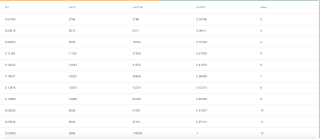
Sunplot provides a nice table view of the frequency table. The frequency table below shows the percent, count, cumulative frequency and cumulative percent for each value (2-12) in the simulation array.


Plotting the Results

Sunplot can also be used to plot specific columns from the frequency table.

In plot below the value column (2-12) from the frequency table is plotted on the x axis. The pct column (percent) from the frequency table is plotted on the y axis.


Below is the plotting expression:

let(a=uniformIntegerDistribution(1, 6),
    b=uniformIntegerDistribution(1, 6),
    c=monteCarlo(add(sample(a), sample(b)), 100000),
    d=freqTable(c),
    x=col(d, value),
    y=col(d, pct),
    plot(type=bar, x=x, y=y)) 

Notice that the x and y variables are set using the col function. The col function moves a field from a list of tuples into an array. In this case it's moving the the value and pct fields from the frequency table tuples into arrays.

We've just completed our first Monte Carlo simulation and plotted the results. As a bonus we've learned the probabilities of a craps game!

Simulations with Real World Data

The example above is using a theoretical probability distribution. There are many different theoretical distributions used in different fields. The first release of Solr's probability distribution framework includes some of the best known distributions including: the normal, log normal, poisson, uniform, binomial, gamma, beta, Wiebull and ZipF distributions.

Each of these distributions are designed to model a particular theoretical data set.

Solr also provides an empirical distribution function which builds a mathematical model based only on actual data.  Empirical distributions can be sampled in exactly the same way as theoretical distributions. This means we can mix and match empirical distributions and theoretical distributions in Monte Carlo simulations.

Let's take a very brief look at a Monte Carlo simulation using empirical distributions pulled from Solr Cloud collections.

In this example we are building a new product which is made up of steel and plastic. Both steel and plastic are bought by the ton on the open market. We have historical pricing data for both steel and plastic and we want to simulate the unit costs based on the historical data.

Here is our simulation expression:

let(a=random(steel, q="*:*", fl="price", rows="2000"),
    b=random(plastic, q="*:*", fl="price", rows="2000")
    c=col(a, price),
    d=col(b, price),
    steel=empiricalDistribtion(c),
    plastic=empiricalDistribtion(d),
    e=monteCarlo(add(mult(sample(steel), .0005), 
                     mult(sample(plastic), .0021)), 
                 100000),
    f=hist(e)

In the example above the let expression is setting the following variables:

  • a is set to the output of the random function. The random function is retrieving 2000 random tuples from the Solr Cloud collection containing steel prices.
  • is set to the output of the random function. The random function is retrieving 2000 random tuples from the Solr Cloud collection containing plastic prices.
  • c is set to the output of the col function, which is copying the price field from the tuples stored in variable a to an array. This is an array of steel prices.
  • is set to the output of the col function, which is copying the price field from the tuples stored in variable b to an array. This is an array of plastic prices.
  • The steel variable is set to the output of the empiricalDistribution function, which is creating an empirical distribution from the array of steel prices.
  • The plastic variable is set to the output of the empiricalDistribution function, which is creating an empirical distribution from the array of plastic prices.
  • e is set to the output of the monteCarlo function. The monteCarlo function runs the function with the formula for unit costs of steel and plastic. Random samples from the empirical distributions for steel and plastic are pulled for each run.
  • f is set to the output of the hist function. The hist function returns the histogram of the output from the pricing simulation. A histogram is used instead of the frequency table when dealing with floating point data.

Thursday, October 5, 2017

How to Model and Remove Time Series Seasonality With Solr 7.1

Often when working with time series data there is a cycle that repeats periodically. This periodic cycle is referred to as seasonality. Seasonality may have a large enough effect on the data that it makes it difficult to study other features of the time series. In Solr 7.1 there are new Streaming Expression statistical functions that allow us to model and remove time series seasonality.

If you aren't familiar with Streaming Expressions new statistical programming functions you may find it useful to read a few of the earlier blogs which introduce the topic.


Seasonality

Often seasonality appears in the data as periodic bumps or waves. These waves can be expressed as sine-waves. For this example we'll start off by generating some smooth sine-waves to represent seasonality. We'll be using Solr's statistical functions to generate the data and Sunplot to plot the sine-waves.

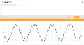
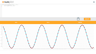
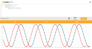
Here is a sample plot using Sunplot:


In the plot you'll notice there are waves in the data occurring at regular intervals. These waves represent the seasonality.

The expression used to generate the sine-waves is:

let(smooth=sin(sequence(100, 0, 6)),
    plot(type=line, y=smooth))        
 
In the function above the let expression is setting a single variable called smooth. The value set to smooth is an array of numbers generated by the sequence function that is wrapped and transformed by the sin function.

Then the let function runs the plot function with the smooth variable as the y axis. Sunplot then plots the data.

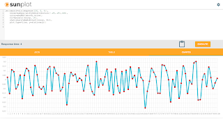
This sine-wave is perfectly smooth so the entire time series consists only of seasonality. To make things more interesting we can add some noise to the sign-waves to represent another component of the time series.


Now the expression looks like this:

let(smooth=sin(sequence(100, 0, 6)),
    noise=sample(uniformDistribution(-.25,.25),100),
    noisy=ebeAdd(smooth, noise),     
    plot(type=line, y=noisy))   


In the expression above we first generate the smooth sine-wave and set it to the variable smooth. Then we generate some random noise by taking a sample from a uniform distribution. The random samples will be uniformly distributed between -.25 and .25. The variable noise holds the array of random noise data.

Then the smooth and noise arrays are added together using the ebeAdd function. The ebeAdd function does an element-by-element addition of the two arrays and outputs an array with the results. This will add the noise to the sine-wave. The variable noisy holds this new noisy array of data.

The noisy array is then set to the y axis of the plot.

Now we have a time series that has both a seasonality component and noisy signal. Let's see how we can model and remove the seasonality so we can study the noisy component.

Modeling Seasonality 

We can model the seasonality using the new polyfit function to fit a curve to the data. The polyfit function is a polynomial curve fitter which builds a function that models non-linear data.

Below is a screenshot of the polyfit function:


Notice that now there is a smooth red curve which models the noisy time series. This is the smooth curve that the polyfit function fit to the noisy time series.

Here is the expression:

let(smooth=sin(sequence(100, 0, 6)),
    noise=sample(uniformDistribution(-.25,.25),100),
    noisy=ebeAdd(smooth,noise), 
    fit=polyfit(noisy, 16),
    x=sequence(100,0,1),          
    list(tuple(plot=line, x=x, y=noisy),
         tuple(plot=line, x=x, y=fit)))   

In the expression above we first build the noisy time series. Then the polyfit function is called on the noisy array with a polynomial degree. The degree describes the exponent size of the polynomial used in the curve fitting function. As the degree rises the function has more flexibility in the curves that it can model. For example a degree of 1 provides a linear model. You can try different degrees until you find the one that best fits your data set. In this example a 16 degree polynomial is used to fit the sine-wave.

Notice that when plotting two lines we use a slightly different plotting syntax. In the syntax above a list of output tuples is used to define the plot for Sunplot. When plotting two plots an x axis must be provided. The sequence function is used to generate an x axis.

 Removing the Seasonality

Once we've fit a curve to the time series we can subtract it away to remove the seasonality. After the subtraction what's left is the noisy signal that we want to study.

Below is a screenshot showing the subtraction of the fitted curve:


Notice that the plot now shows the data that remains after the seasonality has been removed. This time series is now ready to be studied without the effects of the seasonality.

Here is the expressions:

let(smooth=sin(sequence(100, 0, 6)),
    noise=sample(uniformDistribution(-.25,.25),100),
    noisy=ebeAdd(smooth,noise), 
    fit=polyfit(noisy, 16),
    stationary=ebeSubtract(noisy, fit),          
    plot(type=line, y=stationary))     
             
In the expression above the fit array, which holds the fitted curve, is subtracted from the noisy array. The ebeSubtract function performs the element-by-element subtraction. The new time series with the seasonality removed is stored in the stationary variable and plotted on the y axis.

Sunday, August 6, 2017

Time Series Cross-correlation and Lagged Regression With Solr Streaming Expresssions

One of the more interesting capabilities in Solr's new statistical library is cross-correlation. But before diving into cross-correlation, let's start by describing correlation. Correlation measures the extent that two variables fluctuate together. For example if the rise of stock A typically coincides with a rise in stock B they are positively correlated. If a rise in stock A typically coincides with a fall in stock B they are negatively correlated.

When two variables are highly correlated it may be possible to predict the value of one variable based on the value of the other variable. A technique called simple regression can be used to describe the linear relationship between two variables and provide a prediction formula.

Sometimes there is a time lag in the correlation. For example, if stock A rises and three days later stock B rises then there is a 3 day lag time in the correlation. 

We need to account for this lag time before we can perform a regression analysis.

Cross-correlation is a tool for discovering the lag time in correlation between two time series. Once we know the lag time we can account for it in our regression analysis using a technique known as lagged regression

Working With Sine Waves

This blog will demonstrate cross-correlation using simple sine waves. The same approach can be used on time series waveforms generated from data stored in Solr collections.  

The screenshot below shows how to generate and plot a sine wave:


Let's break down what the expression is doing.

let(a=sin(sequence(100, 1, 6)),
    plot(type=line, y=a))

  1. The let expression is setting the variable a and then calling the plot function.
  2. Variable a holds the output of the sin function which is wrapped around a sequence function. The sequence function creates a sequence of 100 numbers, starting from 1 with a stride of 6. The sin function wraps the sequence array and converts it to a sine wave by calling the trigonometric sine function on each element in the array.
  3. The plot function plots a line using the array in variable a as the y axis.

Adding a Second Sine Wave

To demonstrate cross-correlation we'll need to plot a second sine wave and create a lag between the two waveforms.

The screenshot below shows the statistical functions for adding and plotting the second sine wave.


Let's explore the statistical expression:

let(a=sin(sequence(100, 1, 6)),
     b=copyOfRange(a, 5, 100),
     x=sequence(100, 0, 1),
     list(tuple(plot=line, x=x, y=a),
           tuple(plot=line, x=x, y=b)))

  1. The let expression is setting variable a, b, x and returning a list of tuples with plotting data.
  2. Variable a holds the data for the first sine wave.
  3. Variable b has a copy of the array stored in variable a starting from index 5. Starting the second sine wave from the 5th index creates the lag time between the two sine waves. 
  4. Variable x holds a sequence from 0 to 99 which will be used for plotting the x access.
  5. The list contains two output tuples which provide the plotting data. You'll notice that the syntax for plotting two lines does not involve the plot function, but instead requires a list of tuples containing plotting data. As Sunplot matures the syntax for plotting a single line and multiple lines will likely converge. 

Convolution and Cross-correlation

We're going to be using the math behind convolution to cross-correlate the two waveforms. So before delving into cross-correlation its worth having a discussion about convolution.

Convolution is a mathematical operation that has a wide number of uses. In the field of Digital Signal Processing (DSP) convolution is considered the most important function. Convolution is also a key function in deep learning where it's used in convolutional neural networks.

So what is convolution? Convolution takes two waveforms and produces a third waveform through a mathematical operation. The gist of the operation is to reverse one of the waveforms and slide it across the other waveform. As the waveform is slid across the other, a cross product is calculated at each position. The integral of the cross product at each position is stored in a new array which is the "convolution" of the two waveforms.

That's all very interesting, but what does it have to do with cross-correlation? Well as it turns out convolution and cross-correlation are very closely related. The only difference between convolution and cross-correlation is that the waveform being slid across is not reversed.

In the example below the convolve function (conv) is called on two waveforms. Notice that the second waveform is reversed with the rev function before the convolution. This is done because the convolution operation will reverse the second waveform. Since it's already been reversed the convolution function will reverse it again and work with the original waveform.

This will result in a cross-correlation operation rather then convolution.

The screenshot below shows the cross-correlation operation and it's plot.


The highest peak in the cross-correlation plot is the point where the two waveforms have the highest correlation.

Finding the Delay Between Two Time Series

We've visualized the cross-correlation, but how do we use the cross-correlation array to find the delay? We actually have a function called finddelay which will calculate the delay for us. The finddelay function uses convolution math to calculate the cross-correlation array. But instead of returning the cross-correlation array it takes it a step further and calculates the delay.

The screenshot below shows how the finddelay function is called.


Lagged Regression

Once we know the delay between the two sine waves it's very easy to perform the lagged regression. The screenshot below shows the statistical expression and regression result.


Let's quickly review the expression and interpret the regression results:

let(a=sin(sequence(100, 1, 6)),
     b=copyOfRange(a, 5, 100),
     c=finddelay(a, b),  
     d=copyOfRange(a, c, 100),
     r=regress(b, d),  
     tuple(reg=r))

  1. Variables a and b hold the two sine waves with the 5 increment lag time between them.
  2. Variable c holds the delay between the two signals.
  3. Variable d is a copy of the first sine wave starting from the delay index specified in variable c

The sine waves in variables b and d are now in sync and ready to regress.

The regression result is as follows:

{ "reg": { "significance": 0, "totalSumSquares": 48.42686366058407, "R": 1, "meanSquareError": 0, "intercept": 0, "slopeConfidenceInterval": 0, "regressionSumSquares": 48.42686366058407, "slope": 1, "interceptStdErr": 0, "N": 95, "RSquare": 1 } }

The RSquare value of 1 indicates that the regression equation perfectly describes the linear relationship
between the two arrays.

Tuesday, August 1, 2017

A first look at Sunplot, a statistical plotting engine for Solr Streaming Expressions


Sunplot


The last several blogs have discussed the new statistical programming syntax for Streaming Expressions. What was missing in those blogs was plotting.  Plotting plays a central role in statistical analysis. Plotting allows you to quickly understand the shape of your data in a way that the numbers alone cannot.

Sunplot is a new statistical plotting engine written by Michael Suzuki to work specifically with Solr's statistical programming syntax. This blog explores some of the features of Sunplot. 


SQL and Statistical Expressions


Sunplot supports both SQL and Streaming Expressions. The SQL queries are sent to Solr's parallel SQL interface which evaluates the query across Solr Cloud collections. Streaming Expressions and statistical functions are evaluated by Solr's stream handler. 


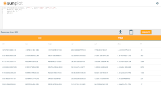
Sunplot has a json view, table view and charting view. The image below shows a SQL query with results in the table view. 


The main code window handles both SQL and Streaming Expressions.


The Plot Function


Plotting of statistical functions is handled by the new plot function. The plot function allows you to specify arrays for the x and y axis and set the plot type. Supported plot types are scatter, line, bar and pie.

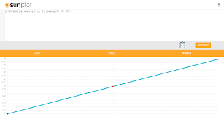
Below is a screenshot of a very simple plot command:


Notice that the plot function is plotting hard-coded arrays. Using this approach you can use Sunplot as a general purpose plotting tool.

The plot function also plots arrays generated by Streaming Expressions and statistical functions.


Scatter Plots


One of the core statistical plot types is the scatter plot. A scatter plot can be used to quickly understand how individual samples are distributed. It is also very helpful in visualizing the outliers in a sample set.

The screenshot below shows a statistical expression and scatter plot of the result set.


Let's explore the statistical syntax shown in the screen shot and interpret the scatter plot.

let(a=random(collection1, q="*:*", rows="500", fl="test_d"),
     b=col(a, test_d),
     plot(type=scatter, y=b))
  1. The let function is setting variables a, b and then executing the plot function.
  2. Variable a is holding the output of the random function. The random function is returning 500 random result tuples from collection1. Each tuple has a single field called test_d.
  3. Variable b is holding the output of the col function. The col function returns a numeric array containing the values in the test_d field from the tuples stored in variable a
  4. The plot function returns the x,y coordinates and the plot type used by Sunplot to draw the plot. In the example the y access is set to the numeric array stored in variable b. If no x axis is provided the plot function will generate a sequence for the x axis. 

Reading the Scatter Plot

The scatter plot moves across the x axis from the left to right and plots the y axis for each point. This allows you to immediately see how the y axis points are spread. 

In the example you can tell a few things very quickly:

1) The points seem to fall fairly evenly above and below 500.
2) The bulk of the points fall between 480 and 520.
3) Virtually all of the points fall between 460 and 540.
4) There are a few outliers below 460 and above 540.

This data set seems to have many of the characteristics of a normal distribution. In a normal distribution most of the points will be clustered above and below the mean. As you continue to move farther away from the mean the number of points taper off until there are just a few outliers.


Sorting the Points

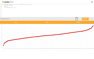
We can learn more about the data set by sorting the y axis points before plotting. In the example below note how the asc function is applied to first sort the y axis points before plotting.


Once sorted you can see the how the lower outliers and upper outliers form curves with steeper slopes while the bulk of the points form a gently sloping line passing through the mean.


Histograms


Now that we've seen the scatter plot of the individual points we can continue to visualize the data by plotting a histogram with the points.

Before plotting lets look at how to create a histogram and what a histogram output looks like:


Let's explore the statistical expression that builds and outputs a histogram:

let(a=random(collection1, q="*:*", rows="500", fl="test_d"),
     b=col(a, test_d),
     c=hist(b, 7),
     get(c))
  1. The let function is setting variables a, b, c and then executes the get function.
  2. Variable a is holding the output of the random function. The random function is returning 500 random result tuples from collection1. Each tuple has a single field called test_d.
  3. Variable b is holding the output of the col function. The col function returns a numeric array containing the values in the test_d field from the tuples stored in variable a
  4. Variable c is holding the output of the hist function. The hist function creates a histogram with 7 bins from the numeric array stored in variable b.  The histogram returns one tuple for each bin with a statistical summary of the bin.
  5. The get function returns the list of histogram tuples held in variable c.
The screenshot above shows the histogram results listed in table view. Each row in the table represents a bin in the histogram. The N field is the number of observations that fall within the bin. The mean is the mean value of observations within the bin.

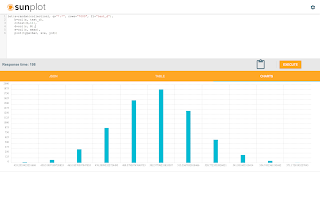
To plot the histogram will need to extract the N and mean columns into arrays. We will then use the mean array as the x axis and the N array as the y axis. We will use 11 bins for the plot.

The screen shot below shows the statistical expression and plot of the histogram:


The histogram plot has the bell curve you would expect to see with a normal distribution. Both the scatter plot and histogram plot are pointing to a normal distribution.

Now we'll take a quick look at a statistical test to confirm that this data is a normal distribution.


Descriptive Statistics


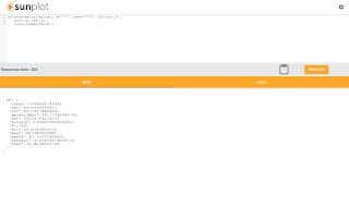
First lets compute the descriptive statistics for the sample set with the describe function:


The statistical expression above outputs a single tuple with the descriptive statistics for the sample set. Notice that the sample has a mean of 500 and a standard deviation of 20. Both the scatter and histogram plots provide visual confirmation of these statistics.


Normal Distribution Testing With Kolmogorov–Smirnov Test


Now that we know the mean and standard deviation we have enough information to run a one sample Kolmogorov–Smirnov (k-s) Test. A one sample k-s test is used to determine if a sample data set fits a reference distribution.  

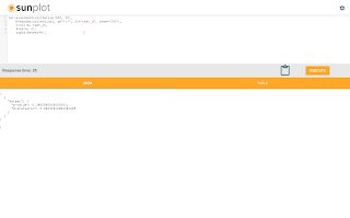
The screenshot below shows the syntax and output for the k-s test: 


The expression in the example calls the normalDistribution function which returns a reference distribution for the ks function. The normalDistribution function is created with a mean of 500 and standard deviation of 20 which is the same as the sample set.

The ks function is then run using the reference distribution and the sample set.

The p-value returned from the ks test is 0.38. This means that there is a 38% chance you would be wrong if you rejected the hypothesis that the sample set could have been taken from the reference distribution. Typically a p-value of .05 or lower is taken as evidence that we can reject the test hypothesis. 

Based on the p-value the ks test confirms that the sample set fits a normal distribution.


Wednesday, July 12, 2017

Detrending Time Series Data With Linear Regression in Solr 7

Often when working with time series data there is a linear trend present in the data. For example if a stock price has been gradually rising over a period of months you'll see a positive slope in the time series data. This slope over time is the trend. Before performing statistical analysis on the time series data it's often necessary to remove the trend.

Why is a trend problematic? Consider an example where you want to correlate two time series that are trending on a similar slope. Because they both have a similar slope they will appear to be correlated. But in reality they may be trending for entirely different reasons. To tell if the two time series are actually correlated you would need to first remove the trends and then perform the correlation on the detrended data. 

Linear Regression 


Linear regression is a statistical tool used to measure the linear relationship between two variables. For example you could use linear regression to determine if there is a linear relationship between age and medical costs. If a linear relationship is found you can use linear regression to predict the value of a dependent variable based on the value of an independent variable.

Linear regression can also be used to remove a linear trend from a time series.

Removing a Linear Trend from a Time Series 


We can remove a linear trend from a time series using the following technique:

  1. Regress the dependent variable over a time sequence. For example if we have 12 months of time series observations the time sequence would be expressed as 1, 2, 3, 4, 5, 6, 7, 8, 9, 10, 11, 12.
  2. Use the regression analysis to predict a dependent value at each time interval. Then subtract the prediction from the actual value. The difference between actual and predicted value is known as the residual. The residuals array is the time series with the trend removed. You can now perform statistical analysis on the residuals.
Sounds complicated, but an example will make this more clear and Solr makes this all very easy to do.

Example: Exploring the linear relationship between marketing spend and site usage.


In this example we want explore the linear relationship between marketing spend and website usage. The motivation for this is to determine if higher marketing spend causes higher website usage. 

Website usage has been trending upwards for over a year. We have been varying the marketing spend throughout the year to experiment with how different levels of marketing spend impacts website usage. 

Now we want to regress the marketing spend and the website usage to build a simple model of how usage is impacted by marketing spend. But before we can build this model we must remove the trend from the website usage or the cumulative effect of the trend will mask the relationship between marketing spend and website usage.

Here is the streaming expression:

let(a=timeseries(logs,  
                           q="rec_type:page_view",  
                           field="rec_time", 
                           start="2016-01-01T00:00:00Z", 
                           end="2016-12-31T00:00:00Z", 
                           gap="+1MONTH",  
                           count(*)),
     b=jdbc(connection="jdbc:mysql://...", 
                  sql="select marketing_expense from monthly_expenses where ..."),
     c=col(a, count(*)),
     d=col(b, marketing_expense),
     e=sequence(length(c), 1, 1),
     f=regress(e, c),
     g=residuals(f, e, c),
     h=regress(d, g),
     tuple(regression=h))     

Let's break down what this expression is doing:

  1. The let expression is setting the variables a, b, c, d, e, f, g, h and returning a single result tuple.
  2. Variable a is holding the result tuples from a timeseries function that is querying the logs for monthly usage counts. 
  3. Variable b is holding the result tuples from a jdbc function which is querying an external database for monthly marketing expenses.
  4. Variable c is holding the output from a col function which returns the values in the count(*) field from the tuples stored in variable a. This is an array containing the monthly usage counts.
  5. Variable d is holding the output from a col function which returns the values in the marketing_expense field from the tuples stored in variable bThis is an array containing the monthly marketing expenses.
  6. Variable e holds the output of the sequence function which returns an array of numbers the same length as the array in variable c. The sequence starts from 1 and has a stride of 1. 
  7. Variable f holds the output of the regress function which returns a regression result. The regression is performed with the sequence in variable e as the independent variable and monthly usage counts in variable c as the dependent variable.
  8. Variable g holds the output of the residuals function which returns the residuals from applying the regression result to the data sets in variables e and c. The residuals are the monthly usage counts with the trend removed.
  9. Variable h holds the output of the regress function which returns a regression result. The regression is being performed with the marketing expenses (variable d) as the independent variable. The residuals from the monthly usage regression (variable g) are the dependent variable.  This regression result will describe the linear relationship between marketing expenses and site usage.
  10. The output tuple is returning the regression result.
     

Sunday, July 9, 2017

One-way ANOVA and Rank Transformation with Solr's Streaming Expressions

In the previous blog we explored the use of random sampling and histograms to pick a threshold for point-wise anomaly detection. Point-wise anomaly detection is a good place to start, but alerting based on a single anomalous point may lead to false alarms. What we need is a statistical technique that can help confirm that the problem goes beyond a single point.

Spotting Differences In Sets of Data


The specific example in the last blog dealt with finding individual log records with unusually high response times. In this blog we'll be looking for sets of log records with unusually high response times.

One approach to doing this is to compare the means of response times between different sets of data. For this we'll use a statistical approach called One-way Anova.

One-way ANOVA (Analysis of Variance)


The Streaming Expression statistical library includes the anova function. The anova function is used to determine if the difference in means between two or more sample sets is statistically significant.

In the example below we'll use ANOVA to compare two samples of data:

  1. A sample taken from a known period of normal response times.
  2. A sample taken before and after the point-wise anomaly.
If the difference in means between the two sets is statistically significant we have evidence that the data around the anomalous data point is also unusual.


Accounting For Outliers


We already know that sample #2 has at least one outlier point. A few large outliers could skew the mean of a sample #2 and bias the ANOVA calculation.

In order to determine if sample set #2 as a whole has a higher mean then sample #1 we need a way to decrease the effect of outliers on the ANOVA calculation.

Rank Transformation


One approach for smoothing outliers is to first rank transform the data sets before running the ANOVA. Rank transformation transforms each value in the data to an ordinal ranking.

The Streaming Expression function library includes the rank function which performs the rank transformation.

In order to compare the data sets following the rank transform, we'll need to perform the rank transformation on both sets of data as if they were one contiguous data set. Streaming Expressions provides array manipulation functions that will allow us do this.


The Streaming Expression


In the expression below we'll perform the ANOVA:

let(a=random(logs,
                       q="rec_time:[2017-05 TO 2017-06]",
                       fq="file_name:index.html",
                       fl="response_time",
                       rows="7000"),
     b=random(logs,
                       q="rec_time:[NOW-10MINUTES TO NOW]",
                       fq="file_name:index.html",
                       fl="response_time",
                       rows="7000"),
     c=col(a, response_time),
     d=col(b, response_time),
     e=addAll(c, d),
     f=rank(e),
     g=copyOfRange(f, 0, length(c)),
     h=copyOfRange(f, length(c), length(f)),
     i=anova(g, h),
     tuple(results=i))

Let's break down what this expression is doing:

  1. The let expression is setting the variables a, b, c, d, e, f, g, h, i and returning a single response tuple.
  2. The variable a holds the tuples from a random sample of response times from a period of normal response times (sample set #1).
  3. The variable b holds the tuples from a random sample of response times before and after the anomalous data point (sample set #2).
  4. Variables c and d hold results of the col function which returns a column of numbers from a list of tuples.  Sample set #1 is in variable c. Sample set #2 is in variable d.
  5. Variable e holds the result of the addAll function which is returning a single array containing the contents of variables c and d.
  6. Variable f holds the results of the rank function which performs the rank transformation on variable e
  7. Variables g and hold the values of copyOfRange functions. The copyOfRange function is used to separate the single rank transformed array back into two data sets. Variable g holds the rank transformed values of sample set #1. Variable h holds the rank transformed values of sample set #2.
  8. Variable i holds the result of the anova function which is performing the ANOVA on variable g and h.
  9. The response tuple has a single field called results that contains the results of the ANOVA on the the rank transformed data sets.

Interpreting the ANOVA p-value


The response from the Streaming Expression above looks like this:

{ "result-set": { "docs": [ { "results": { "p-value": 0.0008137581457111631, "f-ratio": 38.4 } }, { "EOF": true, "RESPONSE_TIME": 789 } ] } }


The p-value of 0.0008 is the percentage chance that there is NOT a statistically significant difference in the means between the two sample sets.

Based on this p-value we can say with a very high level of confidence that there is a statistically significant difference in the means between the two sample sets.

Wednesday, June 28, 2017

Random Sampling, Histograms and Point-wise Anomaly Detection In Solr

In the last blog we started to explore Streaming Expression's new statistical programming functions. The last blog described a statistical expression that retrieved two data sets with SQL expressions, computed the moving averages for the data sets and correlated the moving averages.

In this blog we'll explore random sampling, histograms and rule based point-wise anomaly detection.

Turning Mountains into Mole Hills with Random Sampling


Random sampling is one of the most powerful concepts in statistics. Random sampling involves taking a smaller random sample from a larger data set, which can be used to infer statistics about the larger data set.

Random sampling has been used for decades to deal with the problem of not having access to the entire data set. For example taking a poll of everyone in a large population may not be feasible. Taking a random sample of the population is likely much more feasible.

In the big data age we are often presented with a different problem: too much data. It turns out that random sampling helps solve this problem as well. Instead of having to process the entire massive data set we can select a random sample of the data set and infer statistics about the larger data set.

Note: It's important to understand that working with random samples does introduce potential statistical error. There are formulas for determining the margin of error given specific sample sizes. This link also provides a sample size table which shows margin of errors for specific sample sizes.


Solr is a Powerful Random Sampling Engine


Slicing, dicing and creating random samples from large data sets are some of the primary capabilities needed to tackle big data statistical problems. Solr happens to be one of the best engines in the world for doing this type of work.

Solr has had the ability to select random samples from search results for a long time. The new statistical syntax in Streaming Expressions makes this capability much more powerful. Now Solr has the power to select random samples from large distributed data sets and perform statistical analysis on the random samples.


The Random Streaming Expression


The random Streaming Expression retrieves a pseudo random set of documents that match a query. Each time the random expression is run it will return a different set of pseudo random records.

The syntax for the random expression is:

random(collection1,  q="soly query",  fl="fielda, fieldb", rows="17000")

This simple but powerful expression selects 17,000 pseudo random records from a Solr Cloud collection that matches the query.

Understanding Data Distributions with Histograms


Another important statistical tool is the histogram. Histograms are used to understand the distribution of a data set. Histograms divide a data set into bins and provides statistics about each bin. By inspecting the statistics of each bin you can understand the distribution of the data set.

The hist Function


Solr's Streaming Expression library has a hist function which returns a histogram for an array of numbers.

The hist function has a very simple syntax:

hist(col, 10)

The function above takes two parameters:

  1. An array of numbers
  2. The number of bins in the histogram

Creating a Histogram from a Random Sample


Using the Streaming Expression statistical syntax we can combine random sampling and histograms to understand the distribution of large data sets.

In this example we'll work with a sample data set of log records. Our goal is to create a histogram of the response times for the home page.

Here is the basic syntax:

let(a=random(logs, q="file_name:index.html", fl="response_time", rows="17000"),
     b=col(a, response_time),
     c=hist(b, 10),
     tuple(hist=c))

Let's break down what this expression is doing:

1) The let expression is setting variables a, b and c and then returning a single response tuple.

2) Variable a stores the result tuples from the random streaming expression. The random streaming expression is returning 17000 pseudo random records from the logs collection that match the query file_name:index.html.

3) Variable b stores the output of the col function. The col function returns a column of numbers from a list of tuples. In this case the list of tuples is held in the variable a. The field name is response_time.

4) Variable c stores the output of the hist function. The hist function returns a histogram from a column of numbers. In this case the column of numbers is stored in variable b. The number of bins in the histogram is 10.

5) The tuple expression returns a single output tuple with the hist field set to variable c, which contains the histogram.

The output from this expression is a histogram with 10 bins describing the random sample of home page response times. Descriptive statistics are provided for each bin.

By looking at the histogram we can gain a full understanding of the distribution of the data. Below is a sample histogram. Note that N is the number of observations that are in the bin.

{ "result-set": { "docs": [ { "hist": [ { "min": 105.80360488681794, "max": 184.11423669457605, "mean": 158.07101244548903, "var": 676.6416949523991, "sum": 1106.4970871184232, "stdev": 26.012337360421864, "N": 7 }, { "min": 187.1450299482844, "max": 262.86798264568415, "mean": 235.8519937762809, "var": 400.7486779625581, "sum": 31368.315172245355, "stdev": 20.01870819914607, "N": 133 }, { "min": 263.6907639320808, "max": 341.7723630856346, "mean": 312.0580142849335, "var": 428.02686585995957, "sum": 259944.32589934967, "stdev": 20.688810160566497, "N": 833 }, { "min": 342.0007054044787, "max": 420.508689773685, "mean": 387.10102356966337, "var": 497.5116682425222, "sum": 1008398.166398972, "stdev": 22.30496958622724, "N": 2605 }, { "min": 420.5348042867488, "max": 499.173632576587, "mean": 461.5725595026505, "var": 505.85122370654324, "sum": 2267244.4122770214, "stdev": 22.491136558798964, "N": 4912 }, { "min": 499.23963590242806, "max": 577.8765472307315, "mean": 535.9950922008038, "var": 500.5743269892825, "sum": 2589928.2855142825, "stdev": 22.373518431156118, "N": 4832 }, { "min": 577.9106064943256, "max": 656.5613165857329, "mean": 611.5787667510084, "var": 481.60546877783116, "sum": 1647593.1976272168, "stdev": 21.945511358312686, "N": 2694 }, { "min": 656.5932936523765, "max": 734.7738394881361, "mean": 685.4426886363782, "var": 451.02322430952523, "sum": 573715.5303886493, "stdev": 21.237307369568423, "N": 837 }, { "min": 735.9448445737111, "max": 812.751632738434, "mean": 762.5240648996678, "var": 398.4721757713377, "sum": 102178.22469655548, "stdev": 19.961767851854646, "N": 134 }, { "min": 816.2895922221702, "max": 892.6066799061479, "mean": 832.5779161364087, "var": 481.68131277525964, "sum": 10823.512909773315, "stdev": 21.94723929735263, "N": 13 } ] }, { "EOF": true, "RESPONSE_TIME": 986 } ] } }

Point-wise Anomaly Detection


Point-wise anomaly detection deals with finding a single anomalous data point.

Based on the histogram we can devise a rule for detecting when an anomaly response time appears in the logs. For this example let's set a rule that any response time that falls within the last two bins is an anomaly. The specific rule would be:

response_time > 735

Creating an Alert With the Topic Streaming Expression


Now that we have a rule for detecting anomaly response times we can use the topic expression to return all new records in the logs collection that match the anomaly rule. The topic expression would look like this:

topic(checkpoints,
         logs,
         q="file_name:index.html AND response_time:[735 TO *]",
         fl="id, response_time",
         id="response_anomalies")

The expression above provides one time delivery of all records that match the anomaly rule. Notice the anomaly rule is the query for the topic expression. This is a very efficient approach for retrieving just the anomaly records.

We can wrap the topic in an update and daemon expression to run the topic at intervals and store anomaly records in another collection. The collection of anomalies can then be used for alerting.

Solr temporal graph queries for event correlation, root cause analysis and temporal anomaly detection

Temporal graph queries will be available in the 8.9 release of Apache Solr. Temporal graph queries are designed for key log analytics use ...