Sunday, August 6, 2017

Time Series Cross-correlation and Lagged Regression With Solr Streaming Expresssions

One of the more interesting capabilities in Solr's new statistical library is cross-correlation. But before diving into cross-correlation, let's start by describing correlation. Correlation measures the extent that two variables fluctuate together. For example if the rise of stock A typically coincides with a rise in stock B they are positively correlated. If a rise in stock A typically coincides with a fall in stock B they are negatively correlated.

When two variables are highly correlated it may be possible to predict the value of one variable based on the value of the other variable. A technique called simple regression can be used to describe the linear relationship between two variables and provide a prediction formula.

Sometimes there is a time lag in the correlation. For example, if stock A rises and three days later stock B rises then there is a 3 day lag time in the correlation. 

We need to account for this lag time before we can perform a regression analysis.

Cross-correlation is a tool for discovering the lag time in correlation between two time series. Once we know the lag time we can account for it in our regression analysis using a technique known as lagged regression

Working With Sine Waves

This blog will demonstrate cross-correlation using simple sine waves. The same approach can be used on time series waveforms generated from data stored in Solr collections.  

The screenshot below shows how to generate and plot a sine wave:


Let's break down what the expression is doing.

let(a=sin(sequence(100, 1, 6)),
    plot(type=line, y=a))

  1. The let expression is setting the variable a and then calling the plot function.
  2. Variable a holds the output of the sin function which is wrapped around a sequence function. The sequence function creates a sequence of 100 numbers, starting from 1 with a stride of 6. The sin function wraps the sequence array and converts it to a sine wave by calling the trigonometric sine function on each element in the array.
  3. The plot function plots a line using the array in variable a as the y axis.

Adding a Second Sine Wave

To demonstrate cross-correlation we'll need to plot a second sine wave and create a lag between the two waveforms.

The screenshot below shows the statistical functions for adding and plotting the second sine wave.


Let's explore the statistical expression:

let(a=sin(sequence(100, 1, 6)),
     b=copyOfRange(a, 5, 100),
     x=sequence(100, 0, 1),
     list(tuple(plot=line, x=x, y=a),
           tuple(plot=line, x=x, y=b)))

  1. The let expression is setting variable a, b, x and returning a list of tuples with plotting data.
  2. Variable a holds the data for the first sine wave.
  3. Variable b has a copy of the array stored in variable a starting from index 5. Starting the second sine wave from the 5th index creates the lag time between the two sine waves. 
  4. Variable x holds a sequence from 0 to 99 which will be used for plotting the x access.
  5. The list contains two output tuples which provide the plotting data. You'll notice that the syntax for plotting two lines does not involve the plot function, but instead requires a list of tuples containing plotting data. As Sunplot matures the syntax for plotting a single line and multiple lines will likely converge. 

Convolution and Cross-correlation

We're going to be using the math behind convolution to cross-correlate the two waveforms. So before delving into cross-correlation its worth having a discussion about convolution.

Convolution is a mathematical operation that has a wide number of uses. In the field of Digital Signal Processing (DSP) convolution is considered the most important function. Convolution is also a key function in deep learning where it's used in convolutional neural networks.

So what is convolution? Convolution takes two waveforms and produces a third waveform through a mathematical operation. The gist of the operation is to reverse one of the waveforms and slide it across the other waveform. As the waveform is slid across the other, a cross product is calculated at each position. The integral of the cross product at each position is stored in a new array which is the "convolution" of the two waveforms.

That's all very interesting, but what does it have to do with cross-correlation? Well as it turns out convolution and cross-correlation are very closely related. The only difference between convolution and cross-correlation is that the waveform being slid across is not reversed.

In the example below the convolve function (conv) is called on two waveforms. Notice that the second waveform is reversed with the rev function before the convolution. This is done because the convolution operation will reverse the second waveform. Since it's already been reversed the convolution function will reverse it again and work with the original waveform.

This will result in a cross-correlation operation rather then convolution.

The screenshot below shows the cross-correlation operation and it's plot.


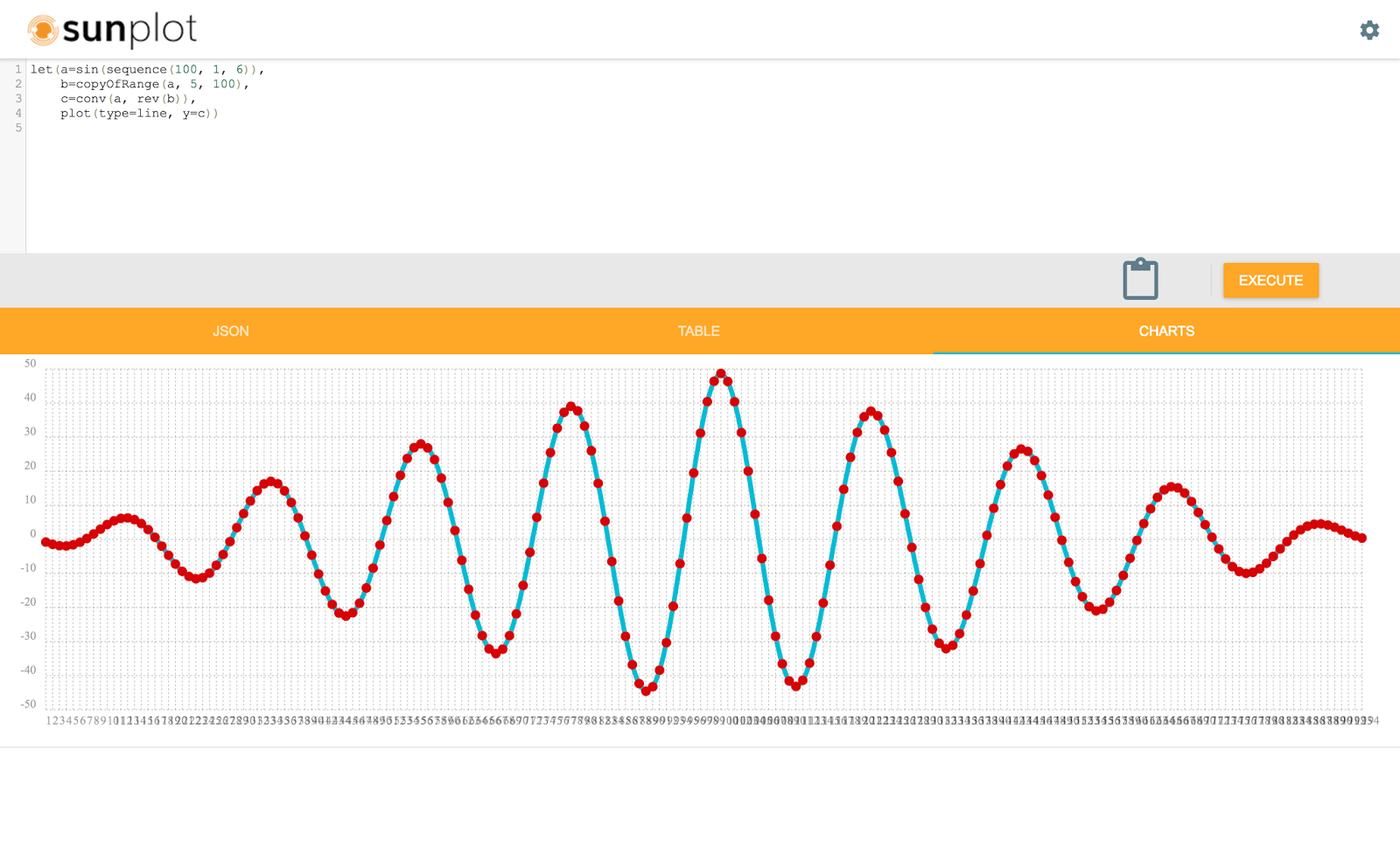
The highest peak in the cross-correlation plot is the point where the two waveforms have the highest correlation.

Finding the Delay Between Two Time Series

We've visualized the cross-correlation, but how do we use the cross-correlation array to find the delay? We actually have a function called finddelay which will calculate the delay for us. The finddelay function uses convolution math to calculate the cross-correlation array. But instead of returning the cross-correlation array it takes it a step further and calculates the delay.

The screenshot below shows how the finddelay function is called.


Lagged Regression

Once we know the delay between the two sine waves it's very easy to perform the lagged regression. The screenshot below shows the statistical expression and regression result.


Let's quickly review the expression and interpret the regression results:

let(a=sin(sequence(100, 1, 6)),
     b=copyOfRange(a, 5, 100),
     c=finddelay(a, b),  
     d=copyOfRange(a, c, 100),
     r=regress(b, d),  
     tuple(reg=r))

  1. Variables a and b hold the two sine waves with the 5 increment lag time between them.
  2. Variable c holds the delay between the two signals.
  3. Variable d is a copy of the first sine wave starting from the delay index specified in variable c

The sine waves in variables b and d are now in sync and ready to regress.

The regression result is as follows:

{ "reg": { "significance": 0, "totalSumSquares": 48.42686366058407, "R": 1, "meanSquareError": 0, "intercept": 0, "slopeConfidenceInterval": 0, "regressionSumSquares": 48.42686366058407, "slope": 1, "interceptStdErr": 0, "N": 95, "RSquare": 1 } }

The RSquare value of 1 indicates that the regression equation perfectly describes the linear relationship
between the two arrays.

Tuesday, August 1, 2017

A first look at Sunplot, a statistical plotting engine for Solr Streaming Expressions


Sunplot


The last several blogs have discussed the new statistical programming syntax for Streaming Expressions. What was missing in those blogs was plotting.  Plotting plays a central role in statistical analysis. Plotting allows you to quickly understand the shape of your data in a way that the numbers alone cannot.

Sunplot is a new statistical plotting engine written by Michael Suzuki to work specifically with Solr's statistical programming syntax. This blog explores some of the features of Sunplot. 


SQL and Statistical Expressions


Sunplot supports both SQL and Streaming Expressions. The SQL queries are sent to Solr's parallel SQL interface which evaluates the query across Solr Cloud collections. Streaming Expressions and statistical functions are evaluated by Solr's stream handler. 


Sunplot has a json view, table view and charting view. The image below shows a SQL query with results in the table view. 


The main code window handles both SQL and Streaming Expressions.


The Plot Function


Plotting of statistical functions is handled by the new plot function. The plot function allows you to specify arrays for the x and y axis and set the plot type. Supported plot types are scatter, line, bar and pie.

Below is a screenshot of a very simple plot command:


Notice that the plot function is plotting hard-coded arrays. Using this approach you can use Sunplot as a general purpose plotting tool.

The plot function also plots arrays generated by Streaming Expressions and statistical functions.


Scatter Plots


One of the core statistical plot types is the scatter plot. A scatter plot can be used to quickly understand how individual samples are distributed. It is also very helpful in visualizing the outliers in a sample set.

The screenshot below shows a statistical expression and scatter plot of the result set.


Let's explore the statistical syntax shown in the screen shot and interpret the scatter plot.

let(a=random(collection1, q="*:*", rows="500", fl="test_d"),
     b=col(a, test_d),
     plot(type=scatter, y=b))
  1. The let function is setting variables a, b and then executing the plot function.
  2. Variable a is holding the output of the random function. The random function is returning 500 random result tuples from collection1. Each tuple has a single field called test_d.
  3. Variable b is holding the output of the col function. The col function returns a numeric array containing the values in the test_d field from the tuples stored in variable a
  4. The plot function returns the x,y coordinates and the plot type used by Sunplot to draw the plot. In the example the y access is set to the numeric array stored in variable b. If no x axis is provided the plot function will generate a sequence for the x axis. 

Reading the Scatter Plot

The scatter plot moves across the x axis from the left to right and plots the y axis for each point. This allows you to immediately see how the y axis points are spread. 

In the example you can tell a few things very quickly:

1) The points seem to fall fairly evenly above and below 500.
2) The bulk of the points fall between 480 and 520.
3) Virtually all of the points fall between 460 and 540.
4) There are a few outliers below 460 and above 540.

This data set seems to have many of the characteristics of a normal distribution. In a normal distribution most of the points will be clustered above and below the mean. As you continue to move farther away from the mean the number of points taper off until there are just a few outliers.


Sorting the Points

We can learn more about the data set by sorting the y axis points before plotting. In the example below note how the asc function is applied to first sort the y axis points before plotting.


Once sorted you can see the how the lower outliers and upper outliers form curves with steeper slopes while the bulk of the points form a gently sloping line passing through the mean.


Histograms


Now that we've seen the scatter plot of the individual points we can continue to visualize the data by plotting a histogram with the points.

Before plotting lets look at how to create a histogram and what a histogram output looks like:


Let's explore the statistical expression that builds and outputs a histogram:

let(a=random(collection1, q="*:*", rows="500", fl="test_d"),
     b=col(a, test_d),
     c=hist(b, 7),
     get(c))
  1. The let function is setting variables a, b, c and then executes the get function.
  2. Variable a is holding the output of the random function. The random function is returning 500 random result tuples from collection1. Each tuple has a single field called test_d.
  3. Variable b is holding the output of the col function. The col function returns a numeric array containing the values in the test_d field from the tuples stored in variable a
  4. Variable c is holding the output of the hist function. The hist function creates a histogram with 7 bins from the numeric array stored in variable b.  The histogram returns one tuple for each bin with a statistical summary of the bin.
  5. The get function returns the list of histogram tuples held in variable c.
The screenshot above shows the histogram results listed in table view. Each row in the table represents a bin in the histogram. The N field is the number of observations that fall within the bin. The mean is the mean value of observations within the bin.

To plot the histogram will need to extract the N and mean columns into arrays. We will then use the mean array as the x axis and the N array as the y axis. We will use 11 bins for the plot.

The screen shot below shows the statistical expression and plot of the histogram:


The histogram plot has the bell curve you would expect to see with a normal distribution. Both the scatter plot and histogram plot are pointing to a normal distribution.

Now we'll take a quick look at a statistical test to confirm that this data is a normal distribution.


Descriptive Statistics


First lets compute the descriptive statistics for the sample set with the describe function:


The statistical expression above outputs a single tuple with the descriptive statistics for the sample set. Notice that the sample has a mean of 500 and a standard deviation of 20. Both the scatter and histogram plots provide visual confirmation of these statistics.


Normal Distribution Testing With Kolmogorov–Smirnov Test


Now that we know the mean and standard deviation we have enough information to run a one sample Kolmogorov–Smirnov (k-s) Test. A one sample k-s test is used to determine if a sample data set fits a reference distribution.  

The screenshot below shows the syntax and output for the k-s test: 


The expression in the example calls the normalDistribution function which returns a reference distribution for the ks function. The normalDistribution function is created with a mean of 500 and standard deviation of 20 which is the same as the sample set.

The ks function is then run using the reference distribution and the sample set.

The p-value returned from the ks test is 0.38. This means that there is a 38% chance you would be wrong if you rejected the hypothesis that the sample set could have been taken from the reference distribution. Typically a p-value of .05 or lower is taken as evidence that we can reject the test hypothesis. 

Based on the p-value the ks test confirms that the sample set fits a normal distribution.


Solr temporal graph queries for event correlation, root cause analysis and temporal anomaly detection

Temporal graph queries will be available in the 8.9 release of Apache Solr. Temporal graph queries are designed for key log analytics use ...